
Hey there all. This is the finish of the tutorial I started last week. Last week I showed how I cut the image out, and this week I am showing some TIPS on how I colored it. I call it Copic TIPS because well.. it is all about how to use the tips to add more color to an image. (DORKY I KNOW).
A lot of times when coloring, even if you have ALL the Copic colors, there is a large discrepancy between the two shades next to each other. When I color up the Skulls, I like to use very light colors, but ...add a bit of dark shading. But for instance the BG70 and BG72 are very different. One method is to pick up the darker color with the lighter one to result in a smear of the darker color in the lighter one.

There are many ways to go about grabbing the color... with the tip of a marker.


Simply take the darker color and scribble on the surface of the transfer medium (I use a small stamp block). Then pick up the amount of color you want with the lighter marker.
Another way to do it is to use the TIP to TIP method. Swipe the darker marker with the lighter marker until you get the amount of color you want on the tip.

I use this method a lot. The other thing is to mix the two methods. You know all that LOVELY ink that gets gooped up on the plastic area of the tip or on the inside of the cap... the stuff that you think OMG it is so wasted. Ok... so maybe it is only me. You can use the same method to pick that ink up as your spare ink.


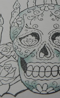
I feathered out from the areas I wanted shaded with the lighter marker. Then I added the darker color in and feathered out.
This technique is great for all sorts of uses. You can mix and match colors. Yellow picking up red for example. I also use it a lot when I want to feather really really light colors to nothing by using the blender marker and picking up one of the really light colors.


Once done, I wrapped up the projectby layering it on the next two Nesties, and adding all my blingy bling.

I hope you found this tutorial just a little bit helpful and can use some of the TIPS provided.
Have an amazing weekend and come back soon!!!
Alaine :-)
This comment has been removed by the author.
ReplyDeleteI hit "return" to soon. *sigh*
ReplyDeleteAnyways, brilliant TIPs to use the ink that migrates onto the marker's cap. It'll make me feel so thrifty!!!
Gorgeous card. I love all the pearls that accentuate the shape of the card.
GREAT tips, Alaine! I'm with Kathi, love the idea of using ink from the cap. Such a wonderful card!
ReplyDeleteThis is an awesome card! The shape of the mat reminds me of the Mission style churches in various parts of Latin America. The shocking pink works really well with the theme too. During a missionary trip to Southeast Mexico, I go to witness the celebration of el Dia de los Muertos, and it was truly fascinating. Your card is an excellent tribute to this cultural tradition.
ReplyDelete